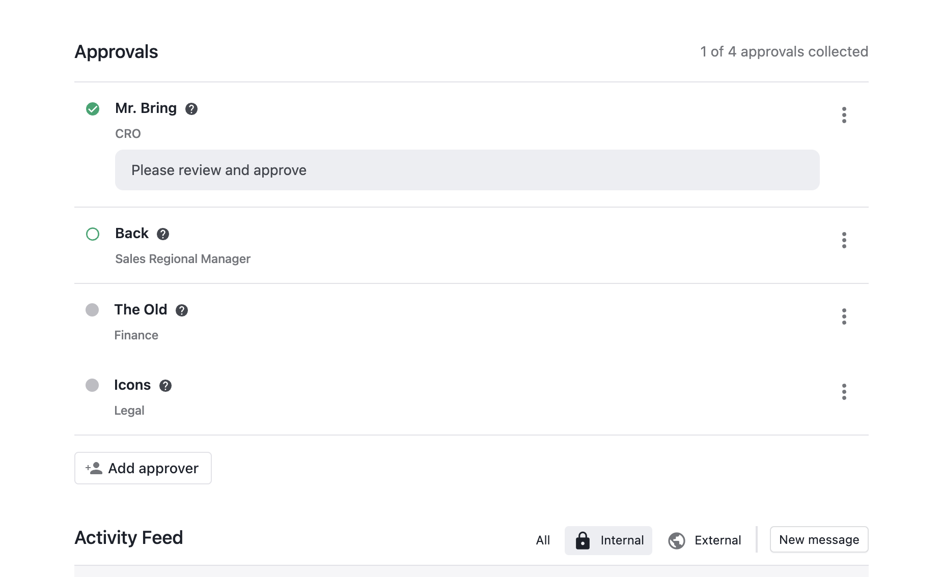
Let's be honest, your average user won't know if an approval is complete with this UI. Yes, I know the UX designer who built this is rolling their eyes as they read this. I would too (honestly!). It's clean, its slick, and its minimalist. So minimalistic that the average Joe/Jane isn't seeing it. The users have spoken (and it wasn't me this time). We need something more explicit.
Bring back the larger green labels with "Approved" text.... pretty please. 🙂